In what ways does your media product use, develop or challenge forms and conventions of a real media product?

My mast head (above) challenges but follows the conventions of traditional mastheads. It's conventional as it’s the largest font on the page and is also placed on the top of the magazine. I have challenged the conventions by keeping allot of white space near my title, I did this to give it a clean sophisticated look to grab my readers attention. I made the writing on my mast head thin and looks like it could be hand written instead of bold and computerised. I got the idea for my front from Jonas brother’s album lines vines and trying times. The font I used was from DA font and was called Renaissance. Another reason I used this font was it was very clear and easy to read, like my magazine. I believe you can tell the style of my magazine through my masthead.
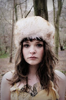
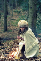
With my images above I wanted to take them all in forest to show straight away what time of year it is. I got the idea from a fashion magazine called Lula.Music magazines normally have a plain white background behind there images I tried to challenge this as much as I could without making my magazine look cheap. My main image was taken as a medium close up to make my model grab the reader’s attention.
The language I used in the magazine was the kind you would hear artists speaking like at festivals. I chose to write this way as I believe it will make my target audience laugh and it will make them feel better about themselves and make them escape into the magazine. E.g. “Bite me bitches” I have used language that links with the target audience. This is conventional as a magazine wants to ensure it’s aiming at its target audience. I mention Freyia’s passion for music a lot as I know it will be on my target audiences mind a lot if not all the time.
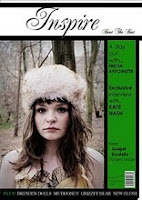
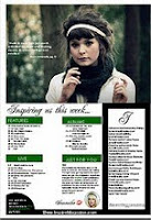
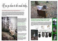
As you can see above the layout of the front cover is quite traditional as it has a main image a mast head and cover lines. I challenge the conventions of a music magazine but putting the cover lines in a separate box. There is no writing over the main image. I did this so the reader could cut out the image and keep it after. I also did this to make sure the reader did not get distracted by the cover lines and was draw in by the model. The banners and puffs are in the same place as most normal magazines on the front cover. In the feature I made certain quotes bigger then others to make important information jump out at the reader.
How does your media product represent particular social groups?
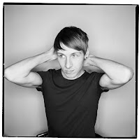
My music magazine is aimed at the indie / aspiring artists aged between 18-28. It’s aimed at social demographic B-D this is because my magazine is affordable and aimed at anyone that has a passion for the music and photography my magazine represents. I feel that I have represented them well within my magazine. The main image shows the innocence of their ambition and draws the reader in straight away. On the front cover my model, Freyia has no expression, in a forest, this is to show the path they have to go through by themselves. Her costume is keep to minimal colours and alternative style which will represent most of my audience dress sense. Most people although they have there own style they look for advice, so by having a column about fashion will help them be guided by their favourite artists. The framing I used is an up close as if my models looking into your eyes. This symbolizes the depth of my magazine. Here are some examples of the kind of people I am aiming for to read my magazine.

what kind of media institution might distribute your media product and why?
I believe that my magazine would be sold by an independent distributor. My magazine aims to target indie social groups and indie stands for independent. If it was sold my a major record label it wont be independent. However, if it is sold by an independent distributor it will be hard to keep profits up and it’s harder to advertise as you will have a lack of funds. You could advertise your magazine at gigs, and get artists to take a picture with the magazine and post it on their web page.
Example of an independent record label is big scary monsters records
Example of a major record label is Emi
How did you attract/address the audience?
I believe I attract my target audience as the main image represents them and they will find themselves in the picture. The language I used was friendly to make the readers feel like they could relate to the person. To make sure my target audience hear about my magazine I would advertise it on social network sites like My space, Face book or Twitter This is because it will travel around on the page but also by word of mouth. The majority of my target audience would also use these social networking sites. I would also sell my magazine at gigs. It will be compulsory that anyone who is featured in the magazine will get a picture either reading or holding the magazine and put it on there social networking page.
what have you learnt about technologies from the process of constructing this product?
I have learnt that when taking photos if you want the sophisticated edge to your image you need to get the correct equipment. It also very important to think about the framing of your image and background to make sure your image can be used to its full potential. Although I had the correct professional camera I found I still needed to edit my image. I had to use a photo editing program called "GIMP" I had to sharpen my images and fade the background more to give it a more professional feel and made my magazine look more realistic. I also used Microsoft publisher to produce the whole magazine. I already had basic skills at using publisher but by doing this magazine I have built on the skills I had and made them better. I have also learnt how to create and maintain a blog. This has helped me show the stages of my magazine as it has come together in a simple and easy way to understand.
Looking back at your preliminary task, what do you feel you have learnt in the progression from it to the full product?
When designing my preliminary task I didn't really do into detail thinking about how I was going to layout my front cover or how the image was going to be framed. I went for a medium shot of my model on a white background but I didn't think too much about the lighting. This made my magazine look very unprofessional and I learnt that the image plays a big part in making your magazine look realistic. As I realised that I made sure on my actual magazine I made my pictures look as professional as possible and they were of high quality. For my preliminary everything was so plain. Although my music magazine is quite plain it still has a sophisticated edge which attracts my audience. My preliminary lacked any edge at all.

My mast head (above) challenges but follows the conventions of traditional mastheads. It's conventional as it’s the largest font on the page and is also placed on the top of the magazine. I have challenged the conventions by keeping allot of white space near my title, I did this to give it a clean sophisticated look to grab my readers attention. I made the writing on my mast head thin and looks like it could be hand written instead of bold and computerised. I got the idea for my front from Jonas brother’s album lines vines and trying times. The font I used was from DA font and was called Renaissance. Another reason I used this font was it was very clear and easy to read, like my magazine. I believe you can tell the style of my magazine through my masthead.


With my images above I wanted to take them all in forest to show straight away what time of year it is. I got the idea from a fashion magazine called Lula.Music magazines normally have a plain white background behind there images I tried to challenge this as much as I could without making my magazine look cheap. My main image was taken as a medium close up to make my model grab the reader’s attention.
The language I used in the magazine was the kind you would hear artists speaking like at festivals. I chose to write this way as I believe it will make my target audience laugh and it will make them feel better about themselves and make them escape into the magazine. E.g. “Bite me bitches” I have used language that links with the target audience. This is conventional as a magazine wants to ensure it’s aiming at its target audience. I mention Freyia’s passion for music a lot as I know it will be on my target audiences mind a lot if not all the time.


As you can see above the layout of the front cover is quite traditional as it has a main image a mast head and cover lines. I challenge the conventions of a music magazine but putting the cover lines in a separate box. There is no writing over the main image. I did this so the reader could cut out the image and keep it after. I also did this to make sure the reader did not get distracted by the cover lines and was draw in by the model. The banners and puffs are in the same place as most normal magazines on the front cover. In the feature I made certain quotes bigger then others to make important information jump out at the reader.
How does your media product represent particular social groups?
My music magazine is aimed at the indie / aspiring artists aged between 18-28. It’s aimed at social demographic B-D this is because my magazine is affordable and aimed at anyone that has a passion for the music and photography my magazine represents. I feel that I have represented them well within my magazine. The main image shows the innocence of their ambition and draws the reader in straight away. On the front cover my model, Freyia has no expression, in a forest, this is to show the path they have to go through by themselves. Her costume is keep to minimal colours and alternative style which will represent most of my audience dress sense. Most people although they have there own style they look for advice, so by having a column about fashion will help them be guided by their favourite artists. The framing I used is an up close as if my models looking into your eyes. This symbolizes the depth of my magazine. Here are some examples of the kind of people I am aiming for to read my magazine.


what kind of media institution might distribute your media product and why?
I believe that my magazine would be sold by an independent distributor. My magazine aims to target indie social groups and indie stands for independent. If it was sold my a major record label it wont be independent. However, if it is sold by an independent distributor it will be hard to keep profits up and it’s harder to advertise as you will have a lack of funds. You could advertise your magazine at gigs, and get artists to take a picture with the magazine and post it on their web page.
Example of an independent record label is big scary monsters records
Example of a major record label is Emi
How did you attract/address the audience?
I believe I attract my target audience as the main image represents them and they will find themselves in the picture. The language I used was friendly to make the readers feel like they could relate to the person. To make sure my target audience hear about my magazine I would advertise it on social network sites like My space, Face book or Twitter This is because it will travel around on the page but also by word of mouth. The majority of my target audience would also use these social networking sites. I would also sell my magazine at gigs. It will be compulsory that anyone who is featured in the magazine will get a picture either reading or holding the magazine and put it on there social networking page.
what have you learnt about technologies from the process of constructing this product?
I have learnt that when taking photos if you want the sophisticated edge to your image you need to get the correct equipment. It also very important to think about the framing of your image and background to make sure your image can be used to its full potential. Although I had the correct professional camera I found I still needed to edit my image. I had to use a photo editing program called "GIMP" I had to sharpen my images and fade the background more to give it a more professional feel and made my magazine look more realistic. I also used Microsoft publisher to produce the whole magazine. I already had basic skills at using publisher but by doing this magazine I have built on the skills I had and made them better. I have also learnt how to create and maintain a blog. This has helped me show the stages of my magazine as it has come together in a simple and easy way to understand.
Looking back at your preliminary task, what do you feel you have learnt in the progression from it to the full product?
When designing my preliminary task I didn't really do into detail thinking about how I was going to layout my front cover or how the image was going to be framed. I went for a medium shot of my model on a white background but I didn't think too much about the lighting. This made my magazine look very unprofessional and I learnt that the image plays a big part in making your magazine look realistic. As I realised that I made sure on my actual magazine I made my pictures look as professional as possible and they were of high quality. For my preliminary everything was so plain. Although my music magazine is quite plain it still has a sophisticated edge which attracts my audience. My preliminary lacked any edge at all.


